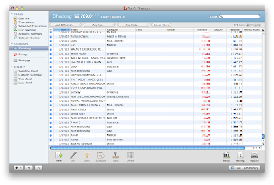
The most obvious change in Quicken Essentials for Mac is in the interface you use for looking at transactions. Gone is the checkbook metaphor - transactions are now in a pretty standard-looking table view:

This table view works just like other table views on the Mac:
- Click on a column header to sort by that header
- Drag a border in a column header to resize that column
The view shown above has the default column settings. Use the View menu or the little gear icon just over the scroll bar to select the columns you wish to view:
There's also a very Mac-like search box you can use to narrow down your transactions:
On the left-hand side of the table view is a sidebar (QEM calls it a source list) that's also a familiar Mac-like metaphor - use it to select different views of your data:
Overall, I'm not too sure how I feel about this new interface. The checkbook visual metaphor is one that Quicken had from the beginning, and it was a classic solution to a design problem - make the interface match what people were doing on paper, so that people would feel comfortable with it (and excited that the computer would do the math for you). Breaking away from this metaphor is going to be hard to adapt to.
(On the other hand, from a programming standpoint using standard Cocoa table views is a huge advantage. Huge. You don't have to write any code to do sorting by columns, you write just a view lines of code to do the neat search box, getting the different types of columns is pretty much a snap)
As a user, one advantage of this new interface is that it does reduce window clutter. Using Quicken 2006 I would often find myself with 4-5 windows open (checking account, savings account, bills, the overview screen).


No comments:
Post a Comment