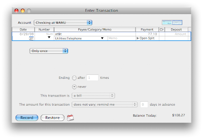
Let's take a minute to consider the process of setting up a scheduled transaction. Imagine I'm setting up my monthly AT&T bill for the new iPhone. You could imagine going through this setup process when you got your first bill; you now know your billing cycle and have an idea of what the monthly amount might be.
I start by going to Bills and Scheduled Transactions, click on the New button, and start entering information. One of the items that I enter is the date of my first bill (8/20/08, as shown in this first image):

Next, I want this to be a monthly transaction (like most bills), so I pick the drop-down list and choose monthly:
My choices in buttons at the bottom are Record and Restore (more on that later). If I click on Record, I get this message:
First transaction is on 9/1/08? I entered 8/20/08! What happened?
This is what happened -- when I selected Monthly for recurrence, Quicken defaulted to day 1 of every 1 month. A better UI design choice would have been to look at the date that I had initially set up when entering my transaction information, and defaulted to that date (the 20th of every 1 month) instead.
Also, what's with the buttons being labeled Record and Restore? The Record button doesn't actually record a transaction in the register, it just adds the transaction to my list of scheduled transactions. It should be labeled "Add", or maybe "Save". Similarly, the button labeled Restore should be "Don't Save", or even "Cancel". Yes, Quicken uses the exact same dialog when editing the settings of a scheduled transaction, and while "Restore" would make sense in that situation, there's no reason why Quicken can't re-label the buttons depending on the situation, or pick something like "Save" and "Don't Save".


No comments:
Post a Comment