Wednesday, August 27, 2008

What I'd like to see in a Quicken iPhone application

I'm a true-blue Apple-head -- I use a Mac at home and work, and I'm an iPhone user as well.  Now that we've got the App Store, it's interesting to think about what I'd like to see in a Quicken iPhone application.

1. As I've mentioned before, I use my bank's ability to download transactions for synchronization into Quicken, but my wife and I do all of the data entry into Quicken manually. The bank downloads serve more as a backup for me, for when a receipt gets lost or shoved in the bottom of a bag.  That brings me to desired feature #1:  On-the-go data entry. It would be handy to be able to make a purchase, start up iPhone Quicken, enter the transaction, and then throw the receipt away.  Entries would then get loaded onto the main computer at next sync, or perhaps using 'push' (when that becomes available later this year).

(This was one feature I liked about pre-OS X Quicken, circa 1998 -- they had a desk accessory that allowed for one-off item entry.  Lowered barrier to data entry = more frequent data entry = more accurate records).

2. I love my iPhone and keep a close eye on it, but it's small, portable, and easily sold on eBay. If my iPhone is lost or stolen, I shouldn't have to worry that bad people would have access to my bank info.  So, desired feature #2: No state secrets on the iPhone.  No bank account numbers.  You can use the alias for accounts I've got set up (for example, "Our Checking").  A current balance would be okay, but think carefully about transaction history.

3. I'm going to manage my checking account and (maybe) my savings account on the go.  Not my mortgage, not my IRA.  (I'd include credit cards on this list, but we're a Dave Ramsey household, and so we don't use credit cards).  Desired feature #3 is simple but important: Having the ability to select which accounts get synched.

4. In our manifesto we've expressed our desire for envelope-based financial management in Quicken.  Here's where an iPhone app could really shine -- support for virtual envelopes.  The trouble with doing real envelopes with real cash is that it's a pain (especially when the kids are in the car and you just want to buy gas at the pump). If the current state of envelopes were available on the iPhone, one could make better decisions on the fly. 

5. Also in the manifesto I cited one of things that made Quicken a killer app -- Quickfill transactions.  I shop at Safeway for groceries, I'm doing data entry, I type in "s-a-f", and boom! it fills in Safeway, fills in the Groceries category.  I just type the amount and I'm good to go. Quicken for iPhone should sync up with my Quickfill transactions.

6. This last item should go without saying, but we are talking about the folks who brought us Quicken 2006 for the Mac.  A clean, simple interface is a must.  

That's my wish list -- what's yours?

Monday, August 25, 2008

On The Front Page!

Quicken Financial Life for Mac has made Intuit's front page, but it's still just an invitation to join the beta program. Being on the front page is encouraging, but the fact that the beta program doesn't seem to have advanced (i.e., actually begun) is disappointing. Who knows?

Update: Bad link before -- now fixed!

Monday, August 18, 2008

Cannot Delete a Split Line in Download

If you're in the download window processing downloaded transactions, and you open up the split transactions, you cannot delete a split transaction. However, if you're adding a transaction from the regular register, you can. If the functionality is available in one place, it should be available in both.

Sunday, August 10, 2008

No Exit

After displaying and changing a report, I often (but not always) get this dialog box when I close the report:


While the basic intent of this is good - "maybe you'd like to save this," the execution is horrible. Suppose I don't want to save it? In this particular case, this was my regular monthy budget report, which I customized to look at the previous month. I don't want to save it. How do I indicate that in this dialog box?

I can't! All I can do is click OK, get the Memorize dialog box, and click Cancel on it. Why the hell isn't there an option not to save this report? Clicking OK is totally counter-intuitive because it says I want to save it, which I don't.

And while we're at it, how about a Cancel button because I may have closed the report by accident.

This kind of user interface mistake is just unforgivable. It is such a fundamental operation that (in my experience) there's always a build-in method to do this automatically. Most/many/all modern user interface toolkits include a simple method to create a two-button (yes/no) or three-button (yes/no/cancel) dialog box. I would even be surprised if a student in one of my classes did something as lame as to only offer an OK button. That's how weak this bug is.

Saturday, August 9, 2008

Dowloading Online Transactions

Why is it that "One Step" (to download transactions) and "Download" (to display them) are two separate windows? If they have to be separate, why is it that "One Step" doesn't bring up "Download" when it's done? And while we're at it, I think that "Download" is a misleading name - it seems like it's where you'd go to download transactions not view downloaded transactions.

Reconciling Online Transactions

Sometimes when I download electronic transactions, they won't reconcile with what I've already entered in my register. The amount is correct. The date is correct. The payee might be slightly different, but that shouldn't matter. On the PC version of Quicken, there is an option to manually match transactions. You can even match multiple transactions as one entry. But, there's no way to do that in Mac Quicken. So, I have to delete the downloaded transaction and manually clear the transaction in my register. Lame.

Friday, August 8, 2008

Alternatives

We really don't want to switch from Quicken on the Mac, but at some point you have to start eying the exits, even if you don't actually bolt from the room.

Before the rumors of a new version came out at MacWorld, I was seriously considering running the Windows version of Quicken under VMware Fusion, which I already own and love. My biggest reason for not pulling the trigger on that was I didn't want to deal with another data conversion - I abandoned Quicken 2004 for the PC shortly before it was de-supported for online transactions.

Here are some applications I've stumbled across on the web. I haven't used any of them, but would love to hear from you if you have used them or know of any others.
Tom: For a while I tried out Mvelopes, an online money management system. At the time that I checked it out (a year and a half ago), it seemed very promising. It supports the "envelope" method of budgeting, so you're planning on where your money will go, instead of after the fact seeing where it went. It links into your bank's online system, so you don't have to do any data entry.

The downside for me at the time was that it's an Ajax application (like Google Docs), and the computer I had at the time (an original 'desklamp' iMac) just didn't quite have the horsepower to run all of the Javascript cleanly. Mvelopes needs you to drag different transactions into different envelopes, and the dragging just didn't work smoothly.

The other problem with Mvelopes is that, by relying on your bank's online system, there's going to be some unknown amount of lag time between when you buy something and when it gets taken out of the respective envelope. This might work okay if you're the only one spending your money, but like Charles, I'm married, and my wife is the one who spends most of our day-to-day expenses (groceries, gas, etc.). She needs to be able to look at a bottom line and get an accurate picture of what's left in the tank.

Thursday, August 7, 2008

Bad UI: Entering Scheduled Transactions


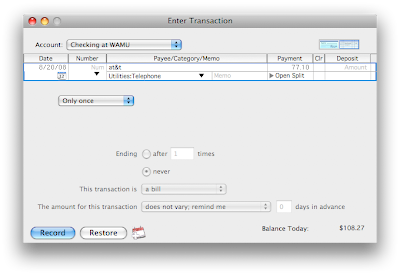
Let's take a minute to consider the process of setting up a scheduled transaction. Imagine I'm setting up my monthly AT&T bill for the new iPhone. You could imagine going through this setup process when you got your first bill; you now know your billing cycle and have an idea of what the monthly amount might be.

I start by going to Bills and Scheduled Transactions, click on the New button, and start entering information. One of the items that I enter is the date of my first bill (8/20/08, as shown in this first image):

Next, I want this to be a monthly transaction (like most bills), so I pick the drop-down list and choose monthly:


My choices in buttons at the bottom are Record and Restore (more on that later).  If I click on Record, I get this message:


First transaction is on 9/1/08? I entered 8/20/08!  What happened?

This is what happened -- when I selected Monthly for recurrence, Quicken defaulted to day 1 of every 1 month.  A better UI design choice would have been to look at the date that I had initially set up when entering my transaction information, and defaulted to that date (the 20th of every 1 month) instead.

Also, what's with the buttons being labeled Record and Restore? The Record button doesn't actually record a transaction in the register, it just adds the transaction to my list of scheduled transactions.  It should be labeled "Add", or maybe "Save".  Similarly, the button labeled Restore should be "Don't Save", or even "Cancel".  Yes, Quicken uses the exact same dialog when editing the settings of a scheduled transaction, and while "Restore" would make sense in that situation, there's no reason why Quicken can't re-label the buttons depending on the situation, or pick something like "Save" and "Don't Save".

Wednesday, August 6, 2008

Manifesto

From a friend of mine: "So you hate Quicken so much that you created a blog for it...and yet you continue to use it?!" This certainly deserves an answer.

Tom: I was an early adopter of Quicken software, starting with my Apple Powerbook 160 in 1994. Charles: I was using Quicken back on an original Mac II; I'm not sure when I started, but I have transactions in my current Quicken file that go back to 1988. Quicken at the time was simple and easy to use, and showed off many of the features that would make it synonymous with money management:
  • Intuitive user interface. The main window looks just like a checkbook register. It's Example A of "how to make it easy for people to use your software". By making the main window look just like what we were used to using in paper and pencil, it empowered users. You've seen this before. You can do this.
  • Autocompletion. You might think of autocompletion of text fields with previously entered information a neat Ajax trick. Quicken had it in the mid-90's, and it further lowered the barrier to entry. It's the complement of the good checkbook register UI design. You want to use Quicken because it looks just like your checkbook, and since it autocompletes (and does the math!), it's easier to use than your checkbook.
  • Nice touches. Pre-Quicken, I was not very disciplined at balancing my checkbook. I was single, making decent money, so balancing my checkbook wasn't high on my priority list. The first time I reconciled my checkbook in Quicken and it gave me that "Congratulations" screen, I was hooked. I still get a little thrill every time I get that screen.
So what happened? I think the folks at Intuit were faced with a problem -- once you get people using your product, how do you keep your revenue stream? If my money management program works just fine, why should I buy the next version? It's a problem faced my many software companies, and the standard solution is to release new versions with an ever-increasing "feature" set. And while some of the new features were well done and made the program more powerful (online stock quotes!), Mac Quicken seemed to lose its way:
  • Stability. There was a period of time when Quicken Mac 2006 would crash on startup on my Mac 3-4 times in a row before it would actually stay open. While that has been resolved, Quicken 2006 will still crash. If there's one piece of software that I'd like to know is going to be stable and bug-free, it's my money application.
  • Bugs. There are features (e.g. budgeting) where there are arithmetic errors. There are reports that never include the right data no matter how many options I choose in Customize.
  • A mutant user interface. I've dealt with a number applications that were created on one platform and ported hastily to another platform, and I've dealt with applications that were developed with a cross-platform user interface tookit. Such applications are always a bit odd but usually tolerable. Quicken Mac 2006 is neither a Mac application nor a Windows application.
  • Ill-conceived features. The birth of online banking was an oppportunity for Intuit. Having an ability to download transactions further reduced the barrier to usage. The promise of not needing to even enter your purchases was very attractive, but ultimately it was poorly implemented. In early releases Intuit seemly hard-coded bank information into the application, so that if your bank changed the specifics of how to access your account (which happened frequently as banks merged), you wouldn't be able to access your information.
  • Lagging releases. Intuit issued a press release in August 2007 saying that Quicken 2008 for the Mac was coming, and they were at the Macworld Expo in January 2008 touting a new version. It's now August 2008, and there's no Quicken in sight. The only page on the Intuit web site that refers to Quicken 2008 for the Mac is the page that lets you sign up for the beta version and "product updates" (no thanks). The Mac version of Quicken is commonly seen as the stepchild of the Windows version, an afterthought at best.
How can Intuit get right? We'd like to see a few things in the next Quicken:
  • Be a Mac application. For all of their faults, one thing that Microsoft does well is making Mac versions of their software that work like Mac applications, and not just ports of the Windows version. Embrace the Mac UI conventions. On the other hand, don't get carried away with the flashy eye candy of Leopard at the expense of nuts-and-bolts functionality.
  • Test, test, test! This should include not just bugs that crash the application, but usability testing as well.
  • Better budgeting tools. The problem with all of the reports and graphs that Quicken does is that it's a forensic tool -- it can tell you what happened to your money, but by then it's already gone. Quicken should fully embrace the "envelope method" of budgeting championed by everyone from Dave Ramsey to The Motley Fool, and make it easy to have virtual envelopes in one account. If Intuit could make virtual envelopes work easily and well, then the marketing materials write themselves. "Quicken virtual envelopes. Have money plans, not money arguments."
As soon as we see a decent version of Quicken for the Mac, we will gladly take down this blog. We would be more than happy to help in any way we possibly can to improve a new version of Quicken. Although neither one of us is a full-time software QA/QC person, we have both developed software, and we understand how difficult it is to develop it. So, we're willing to help, but in the meantime, we're just gonna complain.

Intuit, the ball is in your court.

Quicken and New Math

Below is a screen shot from a budget of mine:

(Yes, I stitched together two columns of screen shots to hide some of the other months, but trust me, this is what it really showed for July.)

My fixed expenses are -271, which is crazy - I assure you I spend money! The flexible expenses seem right. But the total (-271+2415=-424) is just insane. If I drill down into categories and sub-categories, I see similar nonsense.
As I recall, this happened last year about this time of the year, so it must be some goober in that column (July).

Here's another (non-edited) example:


In the last column, the total expenses for auto are $9, while clearly I'm spending more like $300. In the second column, you can see $0, when $975 is budget.

My only work-around is to view the budget under construction using the reports, but that requires changing screens, which is a) annoying, and b) takes a couple of seconds, even with a Core2 Duo.

Obvious arithmetic errors are unforgivable in a financial application. Fortunately, so far as I know, such errors are (thankfully) confined to the budget planning.

Tuesday, August 5, 2008

Quicken Financial Life for Mac

Rumor has it that there will be a non-sucking version of Quicken sometime soon(?). Supposedly, it will be called "Quicken Financial Life for Mac" - rolls off the tongue, doesn't it?

Around the time of MacWorld 2008, there were reports of a brand new version of Quicken in MacRumors, ArsTechnica, and AppleInsider, just to name a few. That was January, but we've heard nothing since. Granted, all the reports said it wouldn't come out until Fall, but I would expect to hear some buzz.

There is a sign-up page for a mythical beta test. We've registered, but still nothing.

We will do what we can to cover this topic, but in the meantime, the silence is deafening.

First Post!

Crashes.  Bad user interface.  Missing features.  Quicken on Windows is the standard by which all other money management applications are measured, but Quicken on the Mac...sucks.